Davies & Co Accountants first asked me to produce a postcard for them on the theme of how to ‘grow’ your business. So we took advantage of the coincidence of their existing blue/purple colour and the bluebells of the season, for a fresh take on accountancy. I also enjoyed making strong graphic use of the ‘D’ shape in their logo.

Next was an advert for the ‘Charnwood News’ magazine. Moving on from the ‘bluebells / growing’ concept, I began to explore the striking graphic possibilities of the ampersand.
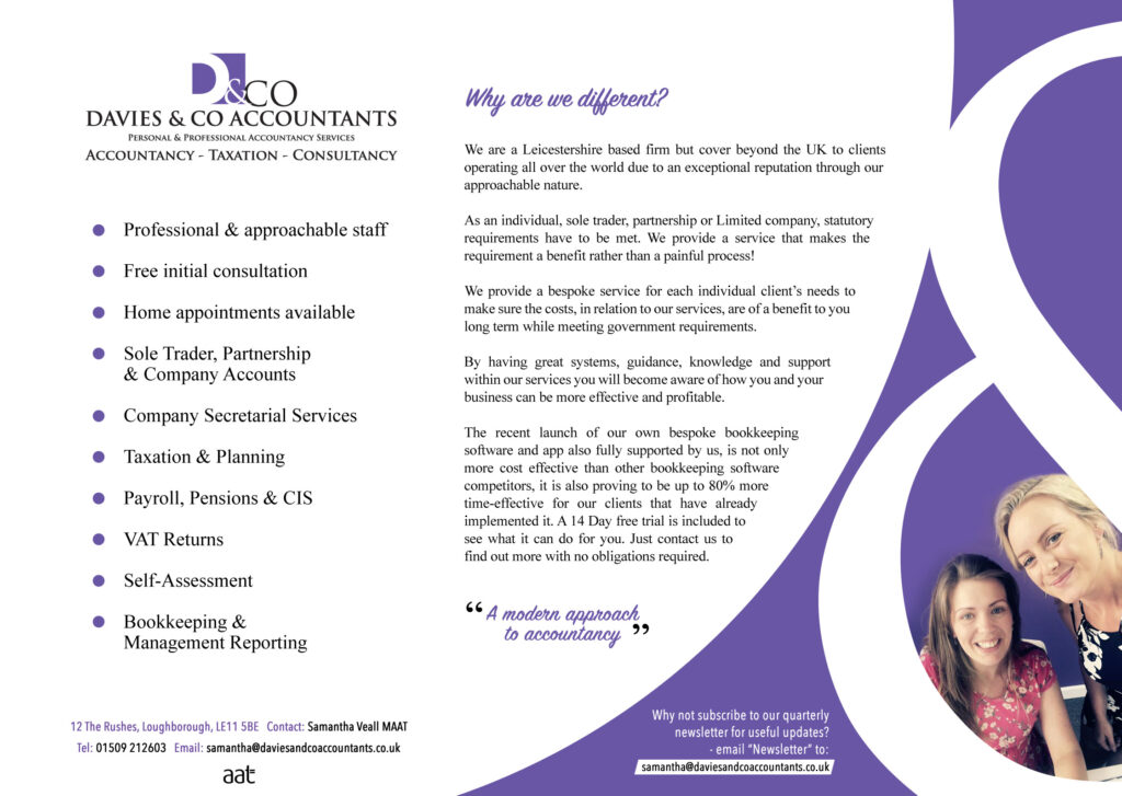
Then we moved on to some A5 flyers using the same concepts.
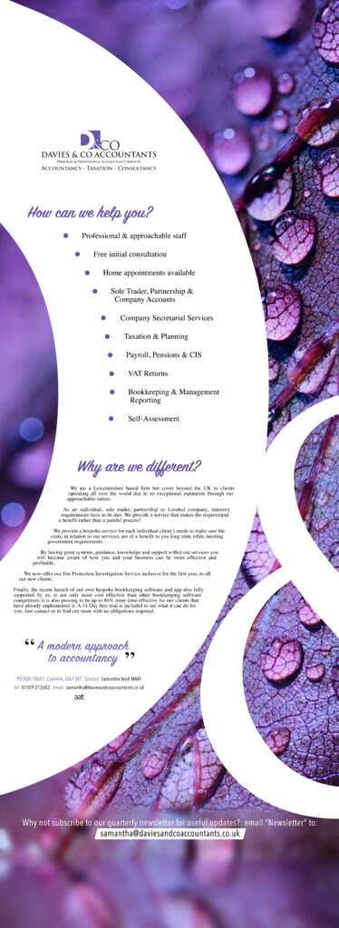
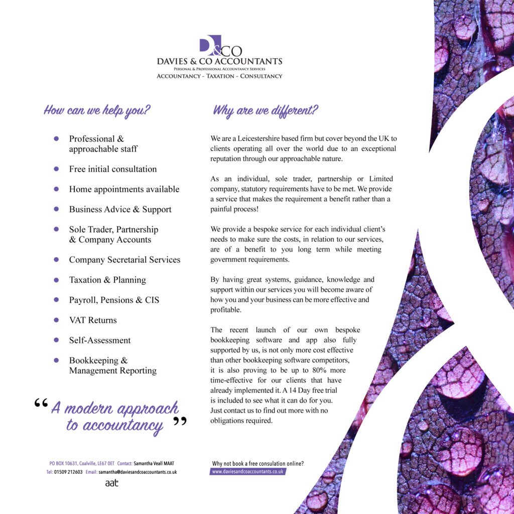
A year or so later, I reformatted the advert for the local golf club magazine. This time, we also lifted the flat purple using a stock leaf image for a fresh feel and some visual texture.
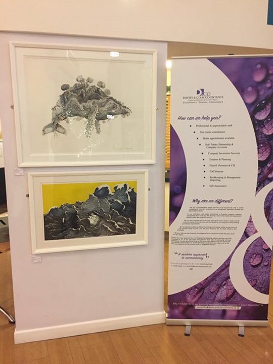
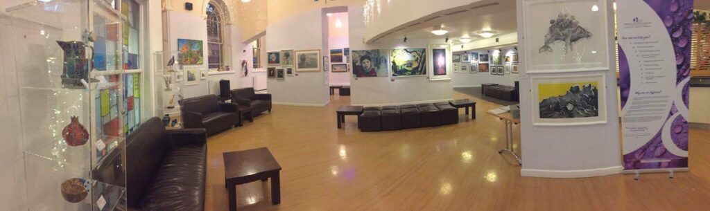
Then we progressed this new styling into a large roll-up banner that appeared in the Loughborough Town Hall Sock Gallery where Davies & Co were sponsoring an event.