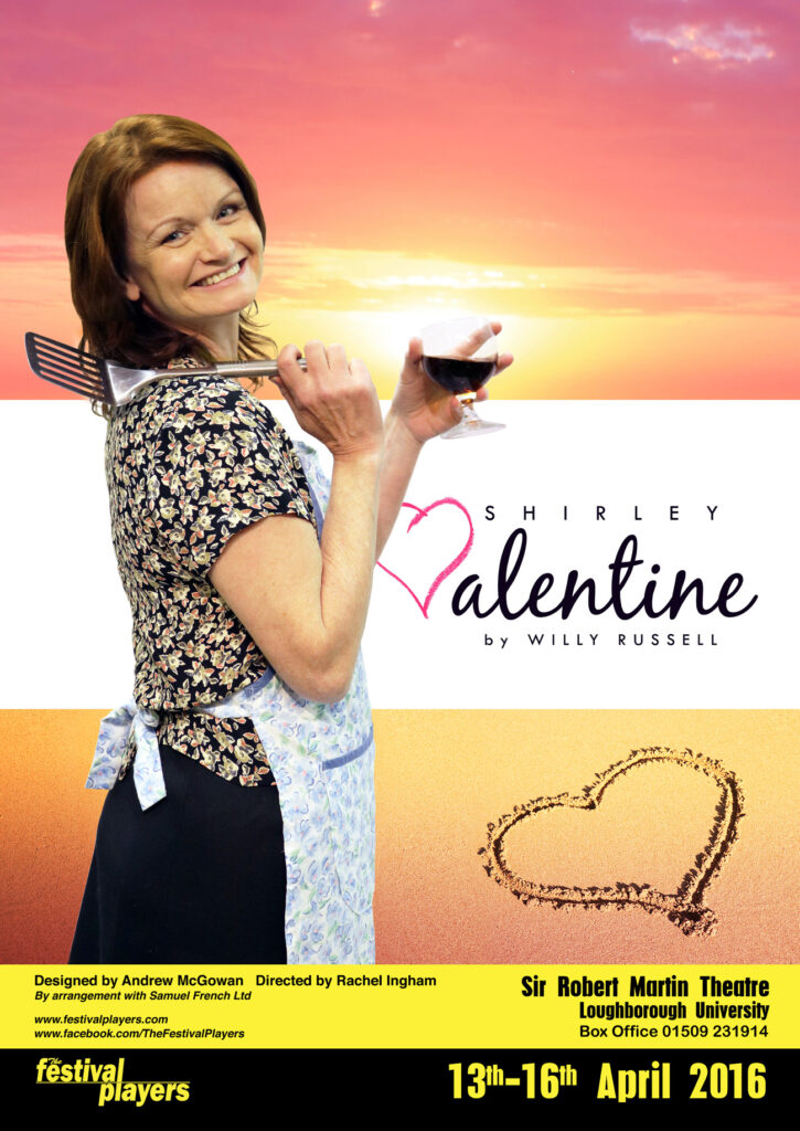
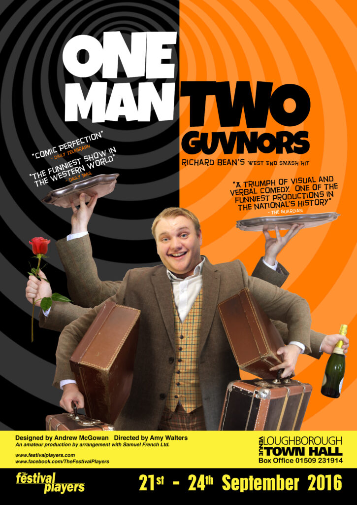
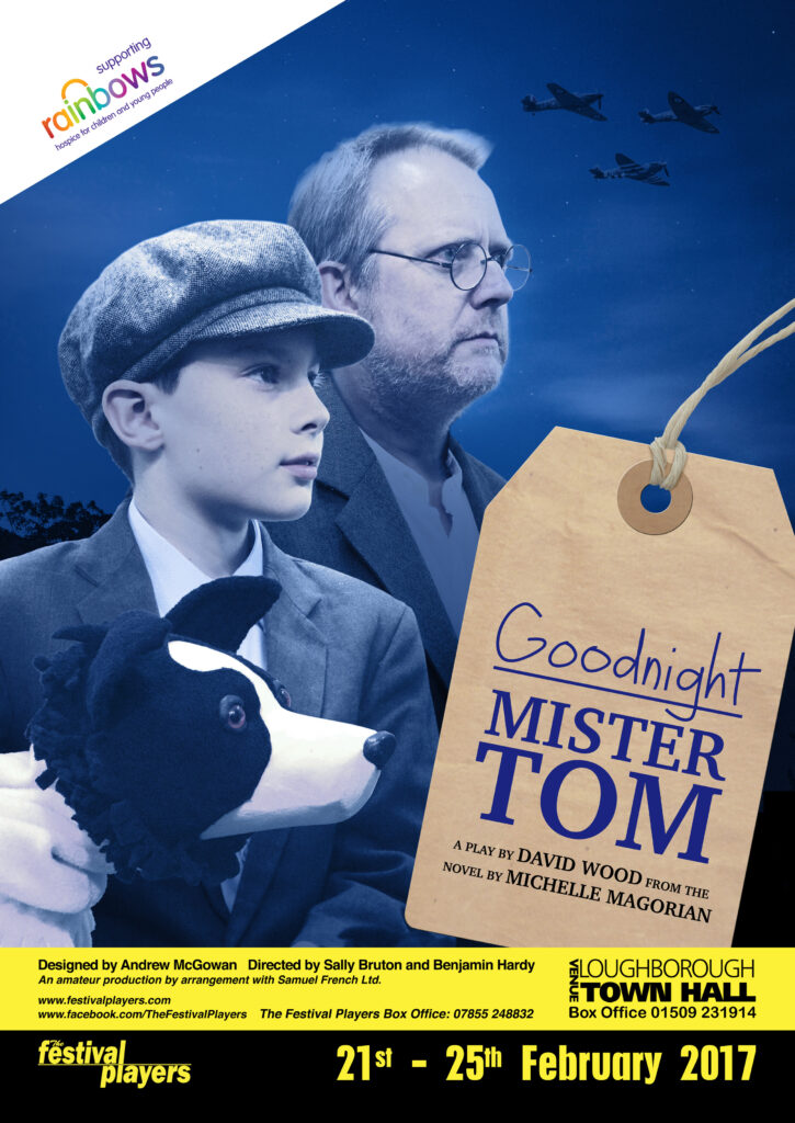
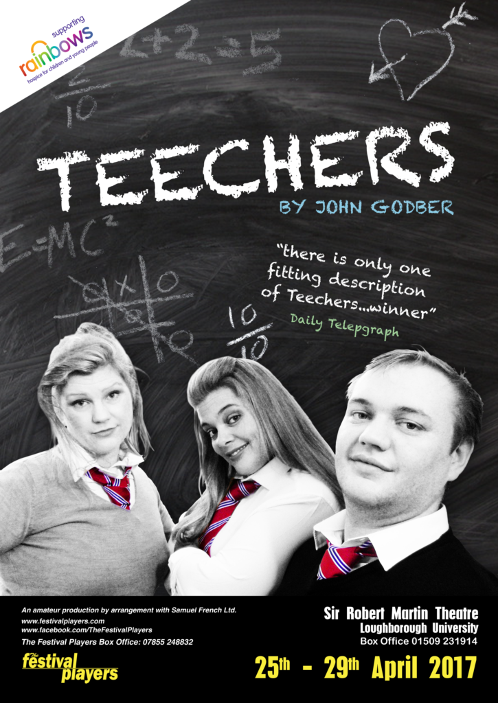
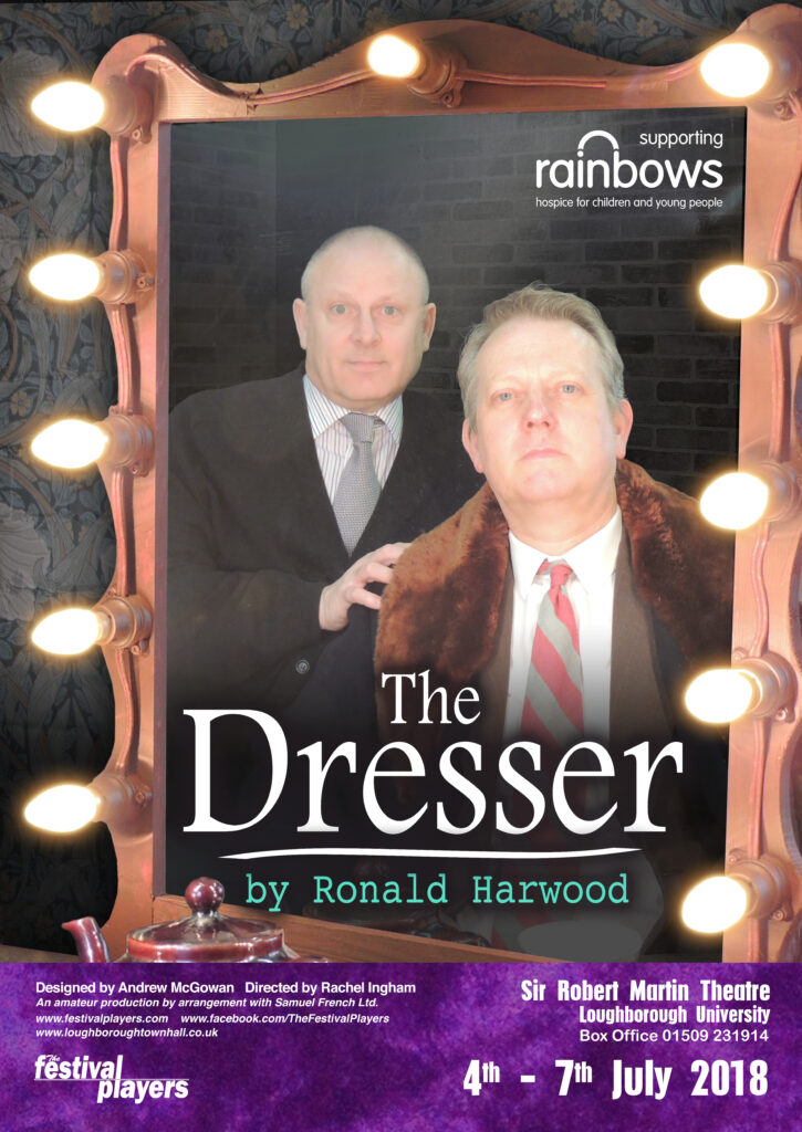
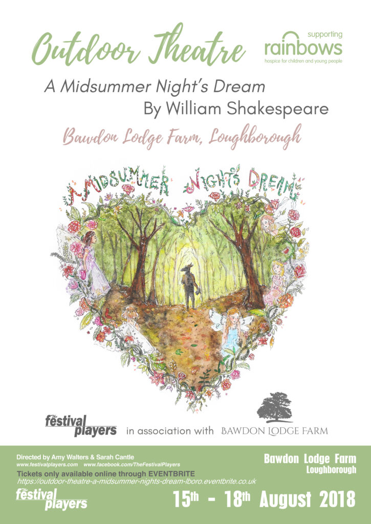
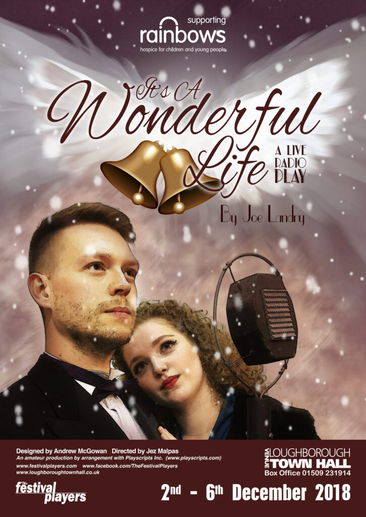
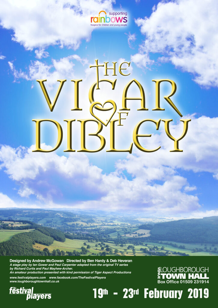
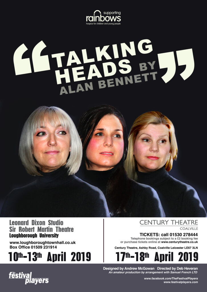
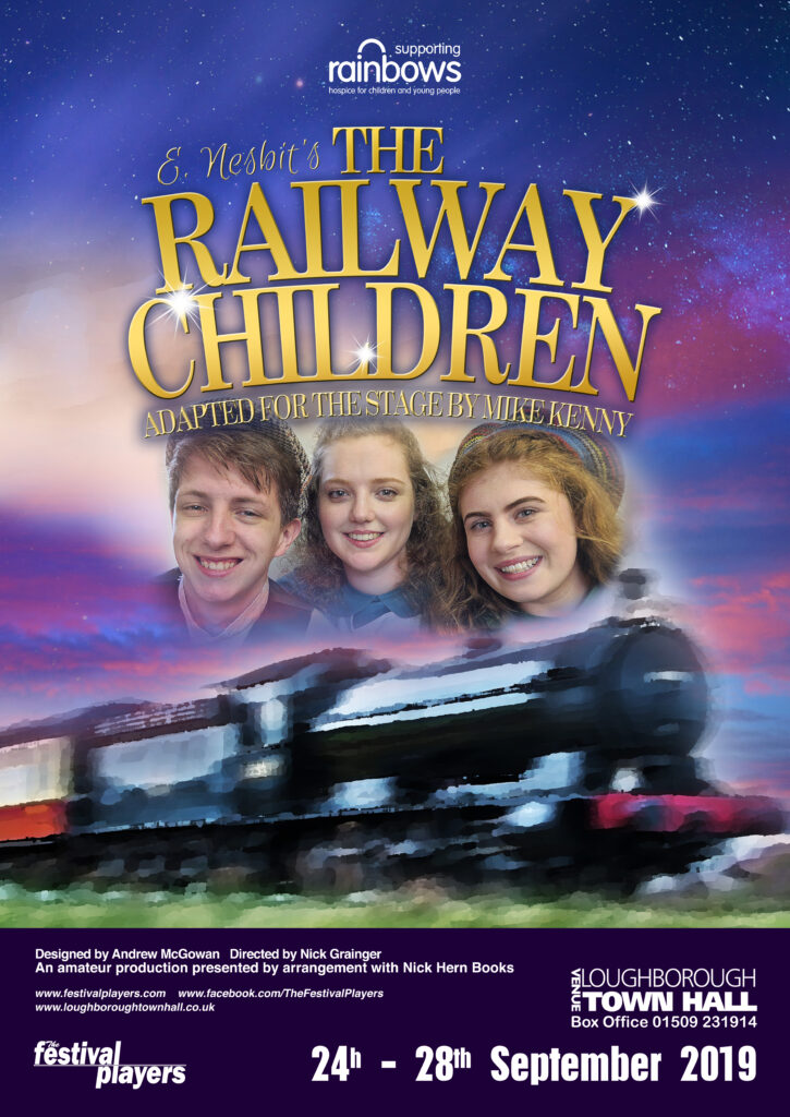
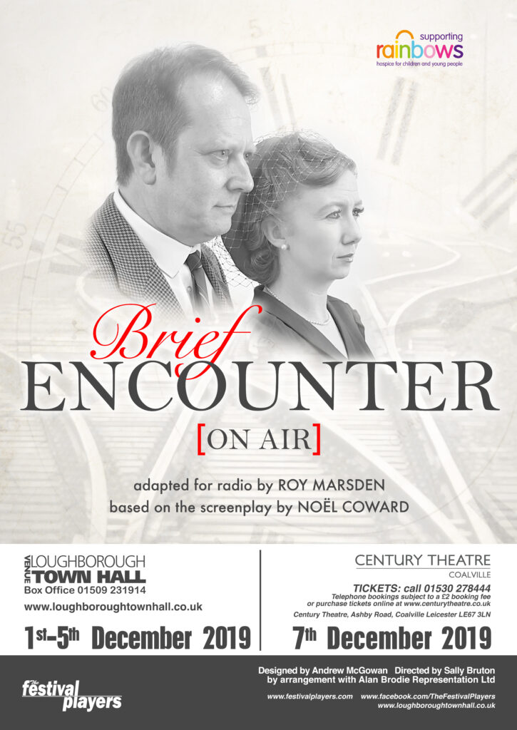
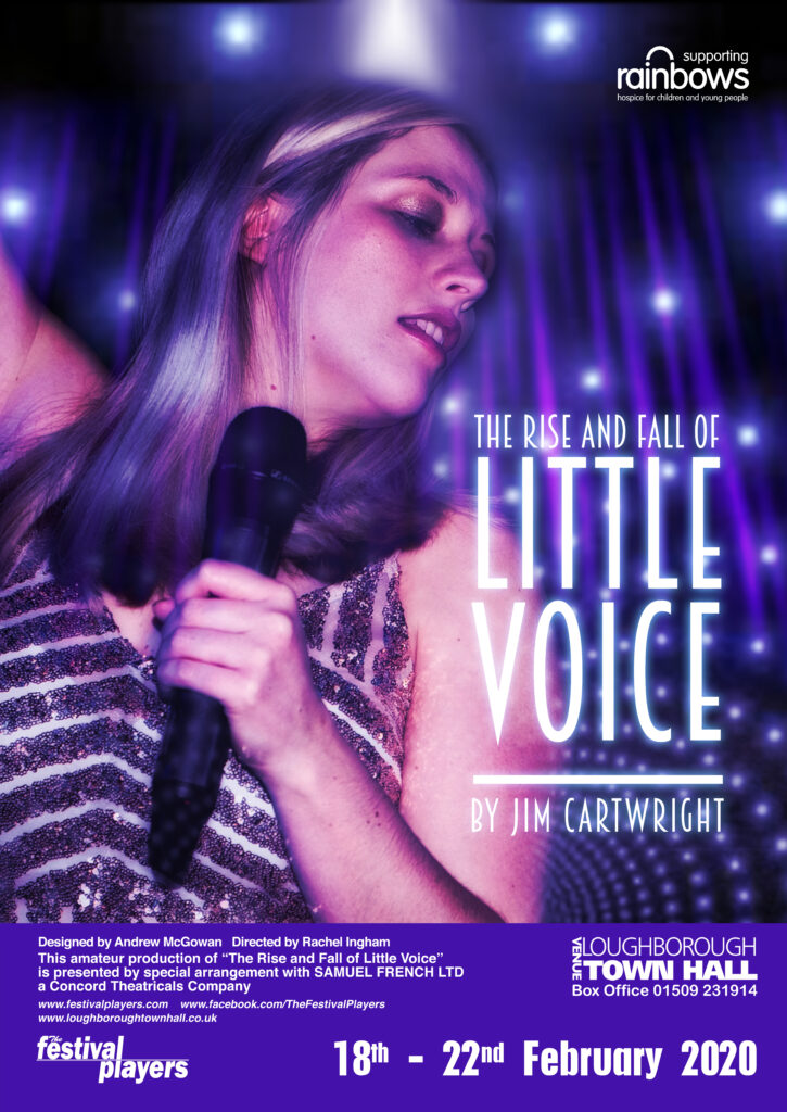
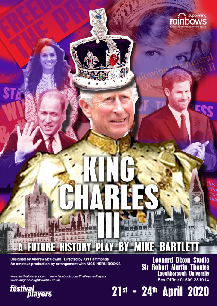
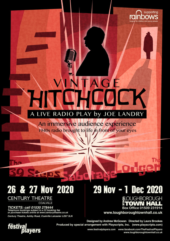
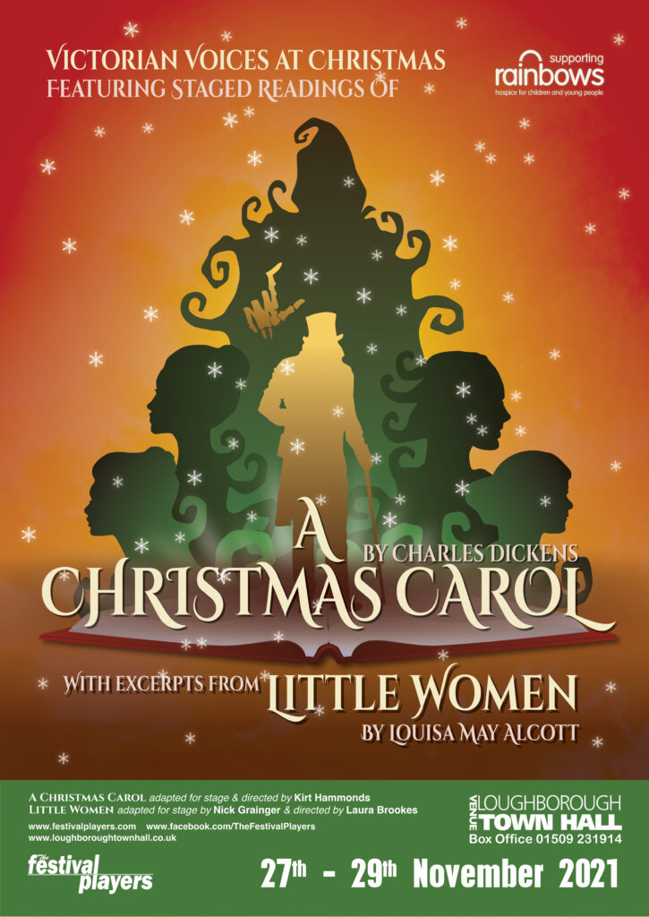
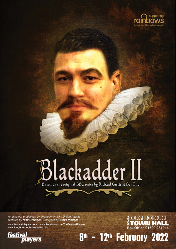
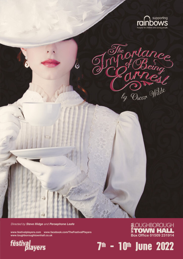
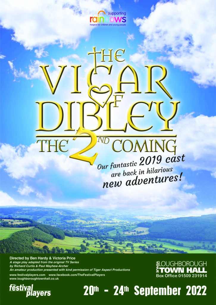
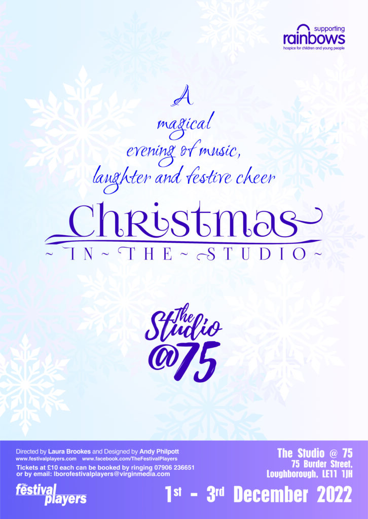
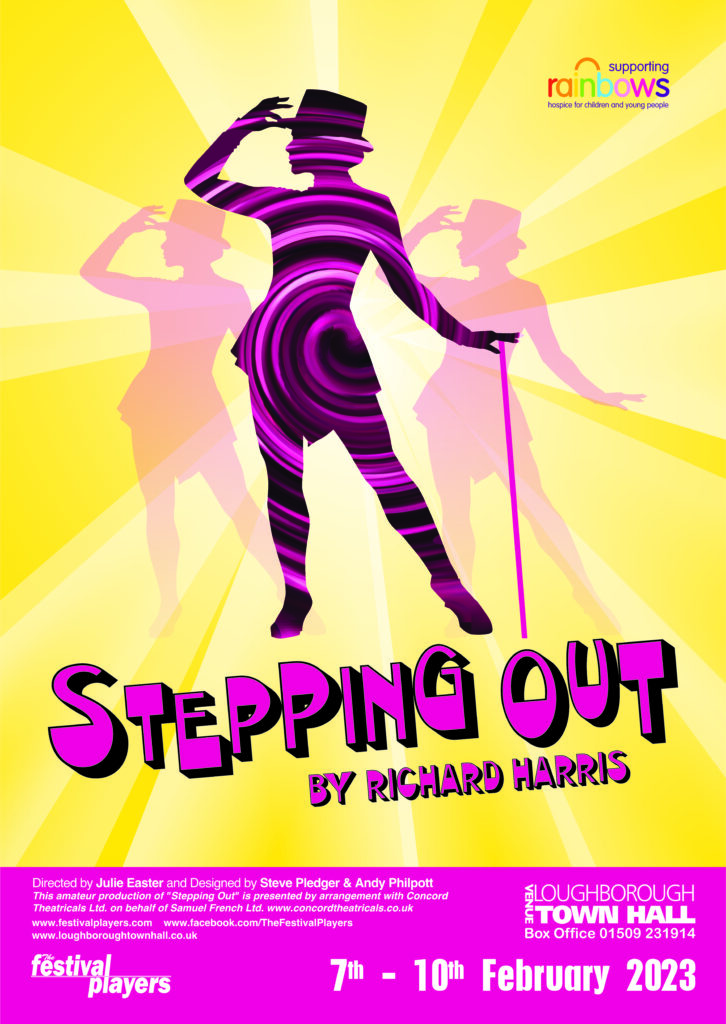
I enjoyed a number of years designing posters and associated media for The Festival Players, a well-established, local group who produce and present plays three to five times a year.
I particularly relished the creative opportunities their wonderful range of plays presented – from re-imagining classics to trying to capture the essence of some less familiar pieces. It was also a satisfying to establish a repeatable design process that has worked effectively and increasingly efficiently over time:
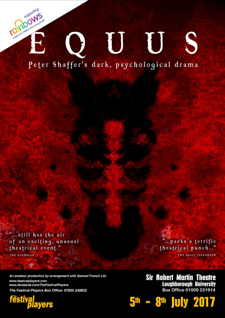
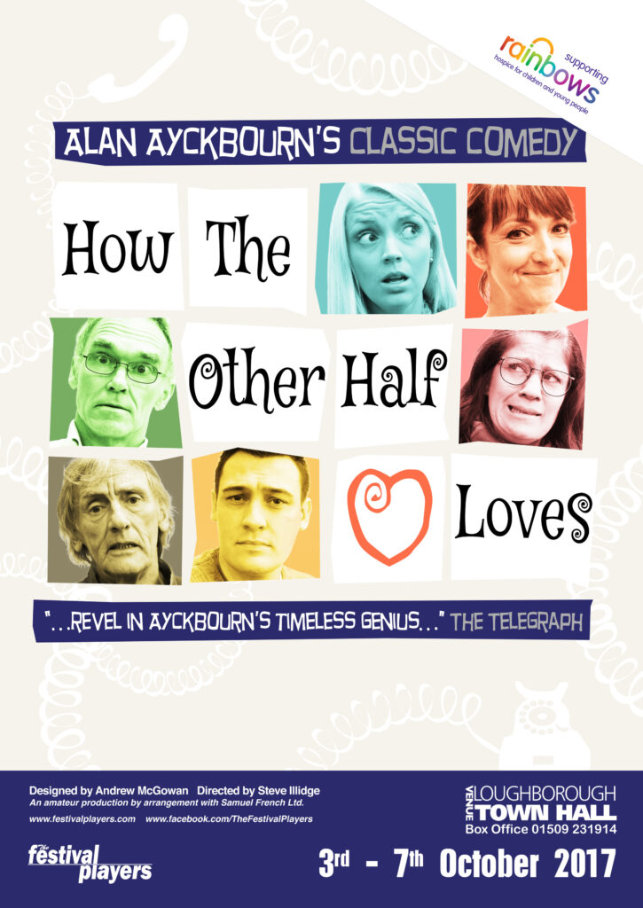
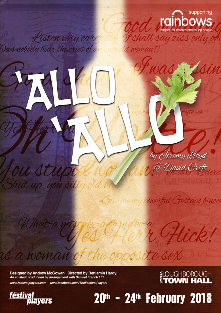
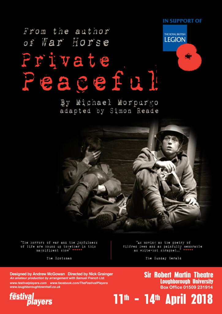
We would usually start with ‘just the title’ – though I always aimed to have a bigger-picture understanding of what might follow, as then, we would often add in imagery and character photography – all the time taking into account the various layout formats the artwork would need to satisfy.
You can click on each poster to see how each design was adapted for all the variations required.
It was nice to develop a recognisable poster format too. Picking up on the company’s long-standing colour scheme, we started with the gold and black ‘banner’ across the bottom. This tidily contains all the essential information and leaves the majority of the space for the main title and eye-catching imagery.
However, we soon found the high contrast of the black and gold tended to ‘compete’ with the main imagery, so we quickly moved on to a simpler banner that could be more sympathetically coloured.
